
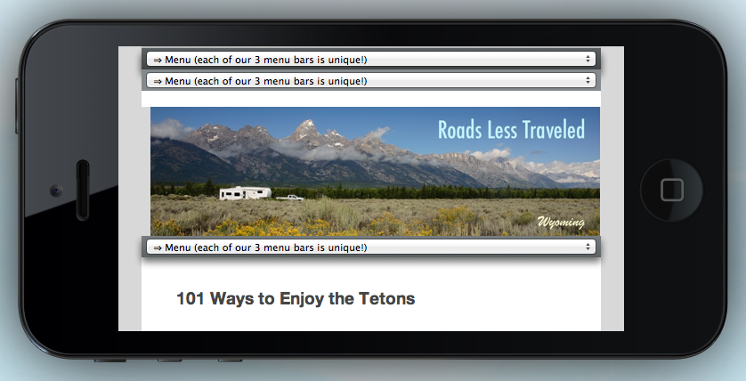
iPhone Simulation, Landscape
We have made some changes to this site that should make it a little easier to view on mobile devices. Yay!
It was partly “mobile ready” before but there were lots of niggling problems.
The post title overlapped on itself, the header image and comments stuck way out to one side, the menus were goofy and stacked on top of each other. Those and other annoyances have been tidied up.
It’s not perfect, but it’s way better!
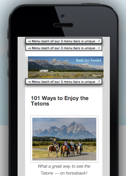
iPhone Simulation, Portrait
So, if you tried viewing this site on a phone or tablet in the past and found it too awkward to view, please give it another try.
Our older pages that were created prior to June, 2012 (before our migration to the WordPress platform), are still not mobile-friendly.
The 175 or so travel pages in that older format will ultimately stay as they are, because it takes about 8 hours to convert each page, and that work is something that has to be squeezed in around the much more fun activities of sightseeing and writing new posts!
However, the dozen or so RV and cruising tips pages in the older format that are accessible from the menu bars will slowly be re-written and migrated over time.
Doing this upgrade was no mean feat, given that we don’t have a smartphone or a tablet.
For other bloggers interested in testing their (or other) sites to see how they look on a few different devices, I found this mobile device simulator very helpful.